Visualization Overview
Andreas Handel
2021-10-28 19:13:24.918718
Overview
In this unit, we will discuss visualization (a.k.a. making figures), what they are good for, and how to do them in R.

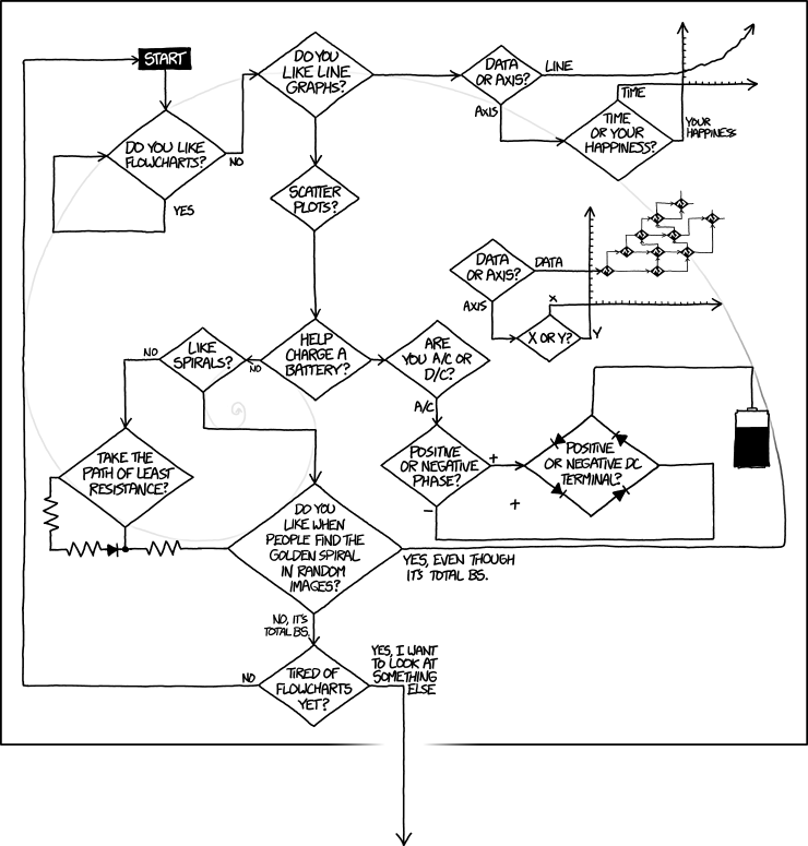
Flowcharts are sometimes, but not always good visualization tools. Source: xkcd.com.
Objectives
- Understand when and how to use graphs.
- Become familiar with major types of graphs and when to use them.
- Learn how to implement high-quality graphs in R.
Motivating Examples
The topic of visualization is enormous, and impossible to cover thoroughly in a week (like pretty much any topic we talk about in this course 😃). To get you started, the two following TED talks provide some examples of interesting and inspiring data visualizations.
In the first video Mona Chalabi talks about good ways to present data and statistics and how good graphs can help in understanding.
In the second video Chris Jordan discusses how one can take abstract facts and make them much more tangible through visualization.
If you are interested, you can find more interesting talks on visualization in this TED topics site and this TED Studies collection.
Visualization uses
Figures and graphs are useful at any stage of your analysis. Use them early to explore your data, to get an idea for what you have, to figure out what cleaning you might need to do, and to check what analysis approaches might be useful. Use visualizations once you have done your analysis to check your results and interpret them. Use them at the end to communicate your results. While tables can be useful tools of communication as well, they tend to be much harder to understand and are – in my opinion – overused in science. Good figures are, most of the time, easier to understand and a more effective way to look at data.
Types of graphs
I am sure you are familiar with different graphs. Some are commonly used and widely overused (e.g., bar plots or pie charts). A nice discussion of bar graphs, why not to use them, and what to use instead can be found in this presentation, with this accompanying document showing how to do it in R.
others types of graphs are less frequently used (e.g., violin plots or hex bins). Instead of me providing summaries of different plots, read the Directory of Visualizations chapter of the excellent Fundamentals of Data Visualization book by Claus Wilke. That chapter provides a quick overview of many common and useful plots. Further chapters in his book describe specific types of plots in more detail, and also provide general best practices for making plots. You should definitely read through those sections describing plots that interest you the most. Also, note that all the graphs in his book are made with ggplot2 and friends. He doesn’t show any code in the book, but if you dig through the Github repository for the book, you’ll likely be able to find code for specific figures.
Further visualization resources
See the general resources page for some additional sources.