Data Analysis Overview
Overview
In this unit, we will talk about the whole data analysis workflow from a general, big-picture perspective. We’ll then revisit the different components in more detail later.
Learning Objectives
- Understand the elements of a data analysis.
- Know the role and importance of each component of a data analysis.
Data Analysis Workflow
The following figure provides a conceptual illustration of the whole data analysis workflow.
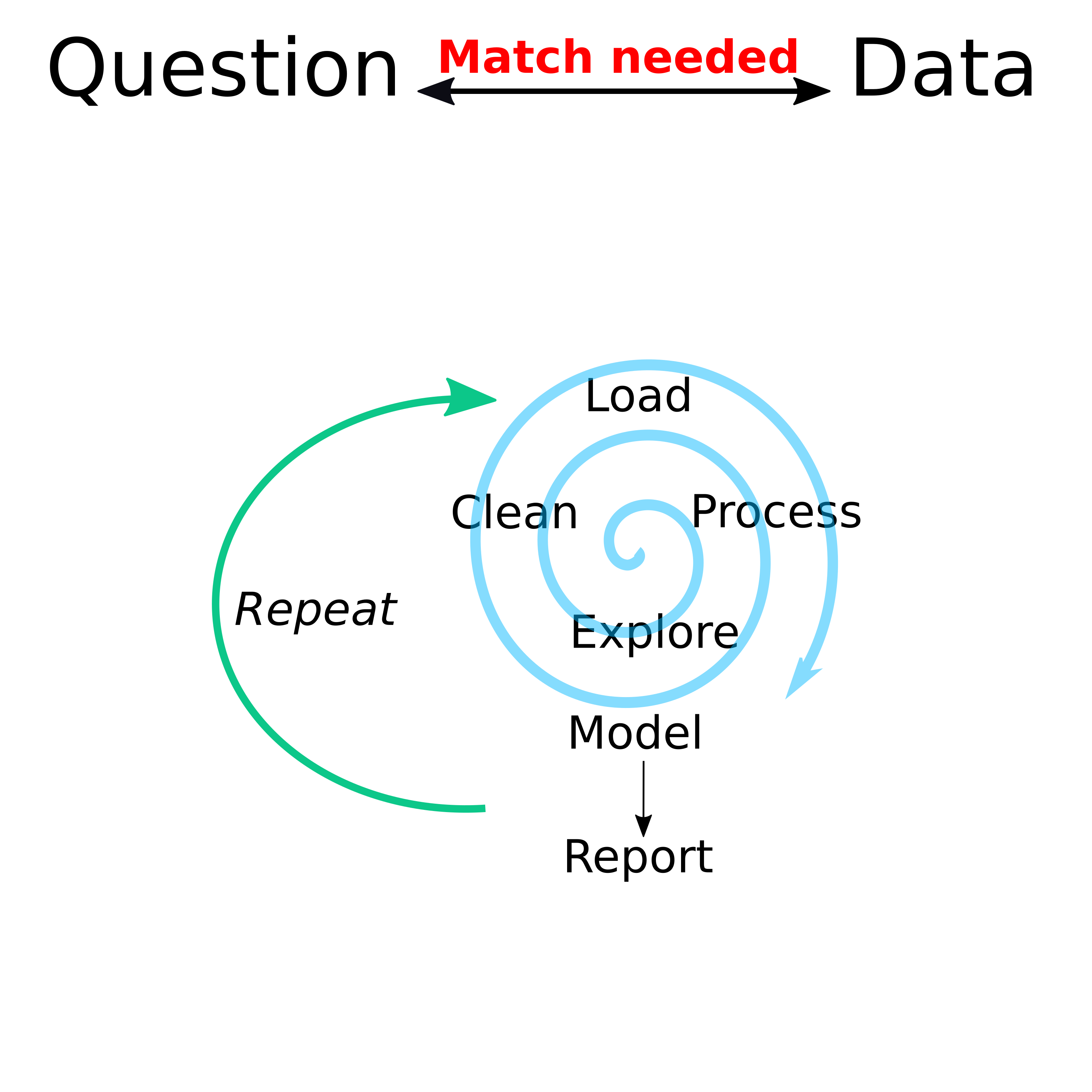
The spiral is meant to represent that while the different steps in an analysis are rarely linear, things should improve over time until you have the data and code in a form that everything fits and you can produce final results.
Some things that might send you around in circles (or hopefully spirals) are:
- Exploring data indicates that more cleaning needs to happen.
- Exploring data indicates that the current question can’t be answered.
- An analysis fails and indicates that cleaning/pre-processing wasn’t adequate.
- A change in analysis method requires different kinds of cleaning and pre-processing.
- Evaluating results indicate that something ‘isn’t quite right’ and needs to be fixed.
- New analysis based on a better understanding of the data and how to best analyze the data and present results.
In the introductory chapter of their great book R for Data Science (R4DS), Garrett Grolemund and Hadley Wickham have a similar diagram. Check out the figure and read through the introductory chapter.
Note that the process of getting the data ready for analysis goes by different names often used slightly differently by different people. In my figure above, I separated cleaning and pre-processing, while in the R4DS chapter and figure, they distinguish between tidying and transforming and together call them wrangling (some people also say munging). Sometimes, these terms mean a specific part of the cleaning process, sometimes they are used interchangeably. You need to guess from the context what is meant, but often you can think of these terms as all having similar meanings.
Let’s look at the different components of an analysis in a bit more detail. The following sections are meant as a conceptual overview. Apart from the Question and Data Match discussion, we will get into each of the other steps and how to do them in more detail later in the course.
Question & Data Match
Maybe the most important challenge of a good scientific project (and thus an interesting and useful data analysis) is to find a combination of questions and data that lead to a project that is both interesting and doable. One could argue that having a good question and suitable data to answer it is part of science/research but not strictly part of the analysis. However, for your data analysis to be meaningful, it is critical to get the question-data match right.
If you start with a boring (or dumb) question or with data that is essentially garbage/noise, or you have a bad question/data match, no part of your analysis matters!
There are different approaches to finding a question-data match. The classical one is to have a specific question or hypothesis, then design a study to collect data, and analyze the collected data to address that specific question.
If you have a question, but you do not have the resources to collect data specifically to answer your question, you can look for existing data that might help you answer your question. You rarely find data that allows you to answer your initial question exactly. But you might find data that enables you to answer a very similar question. You might need to iterate a few times by modifying your question and changing the datasets you use before you have a good match, i.e., a good question and data that allows you to answer it.
Another approach that is becoming more common is to start with the data. You might come across one or multiple datasets that interest you. You can then investigate the data to see what questions you might be able to answer with it. Since the data was not collected to answer your specific question, you will have to be somewhat flexible with the question and let the data guide your analysis. This approach can be very powerful since more and more data are becoming available for analysis.
Any of these different approaches for coming up with a good data-question match are valid. You should always keep in mind that unless you start with the question and analysis plan, then collect the data, then follow your plan exactly, the usual statistics (e.g., p-values and such) do not really apply.
By fiddling with the data or adjusting data and question, you are using what is sometimes called investigator’s degrees of freedom or less kindly, data dredging or data torturing. Essentially, if you fiddle with your data and question long enough, you will eventually find something statistically significant. You cannot interpret this in the same way as a statistically significant result obtained by pre-specifying the question, collecting data specifically to answer the question, and analyzing the data to answer the initial question.
The (former) news site 538 had a nice example, which is not available anymore, but fortunately, the prolific Andrew Heiss, recreated it. Visit this page to Hack Your Way To Scientific Glory. The website gives a nice interactive illustration on how you can adjust your question and data in very reasonable ways so you can get whatever statistically significant result you want. This is researchers’ degrees of freedom in action, and the main reason why p-values are most often meaningless.
That doesn’t mean you can’t do and publish interesting work based on such a secondary data analysis approach! But it does mean that whatever you find should be considered preliminary: hypothesis generating, not hypothesis testing.
Again, unless you fully pre-specify your hypothesis and your exact analysis plan (which is almost never done outside of clinical trials that seek regulatory approval), statistical measures such as p-values are largely meaningless. Unfortunately, to get published, you often need to include those. It’s a sad state of affairs that a lot of published work comes with junk statistics. It will take a good bit of time (if it ever happens), before things become more reasonable (and we will get rid of p-values in most situations).
For some more thoughts on this topic, read chapters 1-3 of The Art of Data Science (ADS). It is a pay what you want book with a minimum price of zero, which means you can get it for free (note that the book + video bundle has a non-zero minimum price). Chapter 2 has a figure similar to the one above.
While I am generally in favor of supporting creators of books (or other content) and thus paying for their products, in this case since I’m making you get/read the book, and also since students have very limited budgets, I think it is entirely acceptable for you to get the book for free.
Getting and loading data
In some sense, the best, but also the most expensive and time-consuming way of getting data, is to collect it yourself. Doing so ensures that the data can answer the question you have. You can also control the quality of the data that is being collected – at least to some extent. However, it is often not feasible to collect your own data. You might not have funding or time or interest to do so. The next best source of data is directly from someone who collected it. The advantage of such data is that you can ask someone for clarification. Also, the person who collected the data is likely a subject matter expert, who can help you generate better questions. Finally, you can get data that is generally available, e.g., in some online resource. This gives you access to a lot of different datasets. The drawback is that the data was not collected to answer your specific question, and there is usually nobody you can ask for clarification.
No matter the source, you need to get the data into your favorite data analysis system (in our case, that will be R). Sometimes, you get data in a format that can be read in easily, e.g., a comma-separated CSV file without any strange formatting that messes up the import. At other times, you might get data in a collection of terribly formatted Excel spreadsheets, or you get it by scraping data from some online source. We’ll look at ways of getting data into R in a later module.
Exploring and cleaning data
Once you have the data loaded into your analysis software, such as R, you want to explore the data to get an overall idea of what is going on. At the same time, you’ll likely have to engage in data cleaning.
Data exploration can and should be done both graphically and by looking at text output of various summaries describing your data, e.g., summary tables for all variables. We will get into that in more detail later. As you explore, you will likely find that your data is dirty, i.e., there are things wrong with it. The amount of data cleaning (also called tidying or wrangling) you need to do depends very much on your data.
A general rule is that you should never directly edit your raw data. If you can, load the raw data into R and do all cleaning inside R with code, so everything is automatically reproducible and documented. Sometimes, you need to edit the files in the format you got before you are even able to load them into R. In those cases, you might have to make modifications in a software other than R. If you can’t directly read the data into R and need to make some changes before, make copies of your raw data and ONLY EDIT THOSE COPIES. Also, write down the edits you made.
There are certain cleaning actions you will need to do with almost any dataset. You will have to find and deal with data entry errors. If the mistake is obvious, you can fix it. If you know the value is wrong but don’t know what it should be, you might need to discard that data. Sometimes you get data that seems way outside the range of all other values, but it is not obviously wrong. For instance, if you had a group of individuals and their weights, a person with a weight of 8000 pounds is obviously not possible. Someone with an 800 pound weight seems wrong, but it’s not impossible. You will have to decide how to deal with such outliers, either during the cleaning or the analysis stage.
In almost any dataset, some values will be missing. First, you need to figure out how missing values are coded and what missing means. Sometimes an empty entry means it was not recorded. At other times, it could be that it is not applicable. For instance on a survey that asks if someone ever smokes, and the next question is for how long, if they say they never smoked, the “how long” question is moot and might be empty, so it is not really a missing value even though nothing is written down. For your analysis, you might want to code it as a duration of 0. We’ll talk more about missing values later in the course.
As you do all the cleaning, you need to get your data into a shape that is ready for analysis. If you apply more than one analytic method, you might need different clean versions of your dataset.
Pause and ponder
At pretty much every stage of your analysis workflow, you should include short pauses where you sit back and briefly contemplate what it all means and what is going on. Careful thinking and reflection is the most important (and unfortunately most under-used) component of a data analysis.
Somewhere during the exploring and cleaning process, you might want to take a longer break. You should have come to a stage where you will be fairly sure if your project is feasible or not, i.e., if you can use the data to answer your question. If not, alter or abandon. Ideally, you will want to alter. That means either changing your question to one that is similar (or sometimes quite different) to your original question, and that can be answered with the data. Or, if feasible, it is to change the data, i.e., get a different dataset or another dataset that contains information which, when combined with your first dataset, lets you answer the question.
Sometimes, you might find that changing the question or data is not possible or will lead to a project that is of no interest to you. In that case, you should abandon your analysis. This is hard, but the honest thing to do.
Don’t keep going hoping against all hope that “magic might happen” and you’ll get a good final product after all. If you keep going, you will get some results. Often, you might even be able to publish them. Unfortunately, they will be useless and wrong - which is a common occurrence in the academic literature - and probably even worse outside of the peer-reviewed academic literature.
Pre-process Data
Additional data processing could be considered part of the cleaning process, or you can think of it as a separate step. Depending on the analytic method you use, some further data processing might be suitable. For instance, some methods work better if you center and scale your predictors. Some methods, such as linear models and related approaches, are not able to handle missing values, so you need to decide how to deal with those. Sometimes it might be good to not include all variables in your model, or to use the existing variables to create new ones (e.g., instead of including height and weight in your model, you might decide to compute BMI and use that variable in your model instead.) The specific pre-processing steps that need to happen depend on the statistical modeling approach(es) you plan on using.
Analyzing Data
You finally reached the step where you can apply actual statistical analysis to your data. This topic takes up the majority of time in most (bio)statistics courses. While it is obviously very important to get the statistical analysis right, for any real data analysis you will likely spend <25% of your time on this task. The majority of your time (though not computing time) goes into the other tasks.
At this stage in the process, you should know your data well enough to apply statistical methods and approaches that are suitable for your data and question. You can either use a single approach or explore multiple different ones. As you will learn in this course, trying more than one approach is quite easy. If you try multiple models, you need to be careful to not overfit by only picking and reporting the models and analyses that give you the results you want. If you analyze data in multiple ways, report all results.
Evaluating and interpreting results
Once you have your results, and before you decide on how (or if) to report them, you should take another break and carefully contemplate what your findings mean. Do the results make sense? Occasionally, there is some new and interesting finding that goes against everything we think we know. However, most of the time if you find something that doesn’t ring true (e.g., increased exercise shortens your lifespan), it probably isn’t. You need to think carefully about what your result actually means and how to interpret results. We can certainly think of a way to get a result that suggests increased exercise shortens lifespan. For instance, we could look at a group of people who practice some kind of extreme sport that not infrequently leads to death, and compare that group to people who do not practice this sport. You might find that those with increased exercise live less long in that particular scenario. But of course, that doesn’t mean you have overall shown that normal exercise shortens lifespan. For a real epidemiology example, you can read about the birth weight paradox, where researchers found that smoking during pregnancy lead to lower infant mortality – of course this was false and was later explained by sampling bias.
Unfortunately, the scientific literature is full of examples where the interpretation of the results are likely not right. A good and amusing example was published in the New England Journal of Medicine, a very prestigious journal, by Messerli 2012. The showed that chocolate consumption and Nobel prizes were correlated. While there is no arguing with the data, the interpretation that “…it seems most likely that in a dose-dependent way, chocolate intake provides the abundant fertile ground needed for the sprouting of Nobel laureates…” is of course nonsense, see also this article for a more general discussion. You can find more rebuttals online. Unfortunately, since the original study was in a prestigious journal, the nonsense was widely reported in the media. You can see Forbes, BusinessInsider, Time Magazine, and some other news outlets reporting the finding fairly uncritically. To this day, I do not know if this article was meant as a satire or for real.
Reporting and communicating your results
Unless you do an analysis just for yourself, you will want to communicate your findings to others. In academia, this is usually done with peer-reviewed publications, as well as presentations at conferences in the form of talks (for which most people use slides) and posters. In those settings, the readers or listeners are usually your peers.
Outside of academia, you might also need to present your work in written or oral form, but it might have a different target audience. For instance, you might want to communicate your findings to a lay audience, to your superiors, to groups of stakeholders, to colleagues and team members, etc.
While you will need to tailor your products and way of communication to your situation and audience, there are components that are common. Figures, tables, and descriptive text are almost always used.
You want to make as much of your reporting automated as possible. For that, all figures, tables, and numeric results should be auto-generated by code. Similarly, for an efficient and automated workflow, you will want as many aspects of the products (reports, slides, etc.) as possible to be automated. Of course, you have to write the text yourself. But results should be loaded automatically, and text layout should be automated, as should formatting of references. You also want to use a system that is as flexible as possible. Quarto is ideal because you are writing in plain text and can easily send the text into different output formats, e.g., reports, slides, posters, websites, blogs, etc. This is much harder to do with other common software. E.g., going from Word to Excel to Powerpoint is much less seamless and certainly not automated.
You want automation for both efficiency and reproducibility purposes. Especially if you design an analysis that might be repeated often (maybe not so common in academia, but very common in other settings), you want to be able to automatically re-run and regenerate as much of the whole process as possible.
Further reading
Above, I gave you my thoughts related to the various steps of the data analysis workflow. It’s good to hear it from multiple sources. To that end, go back to The Art of Data Science (ADS) and read through chapters 4 and 9-11.