iris |>
  head() |>
knitr::kable()| Sepal.Length | Sepal.Width | Petal.Length | Petal.Width | Species |
|---|---|---|---|---|
| 5.1 | 3.5 | 1.4 | 0.2 | setosa |
| 4.9 | 3.0 | 1.4 | 0.2 | setosa |
| 4.7 | 3.2 | 1.3 | 0.2 | setosa |
| 4.6 | 3.1 | 1.5 | 0.2 | setosa |
| 5.0 | 3.6 | 1.4 | 0.2 | setosa |
| 5.4 | 3.9 | 1.7 | 0.4 | setosa |
In this unit, we will discuss how to make publication-ready tables of data in R, and when making tables is appropriate (compared to visualizations).
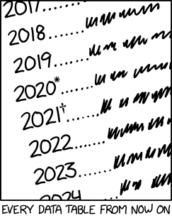
On average, tables are much more straightforward than visualizations. (Of course there are exceptions.) A table is a way of presenting data in a grid of rows and columns. Of course, like figures, tables have titles and captions in scientific literature, and many have footnotes (like the comic above alludes to) which explain some detail of the table.
While we almost always prefer making visualizations, sometimes data naturally lend themselves to a tabular format. We’ll discuss the potential pitfalls of tables later in this unit. Cole Nussbaumer, the author of a somewhat well-known book called Storytelling with Data, has written about when to use tables on the SWD blog. In general, you should prefer tables in the following circumstances.
Whatever the case is, you will need to make tables with your data at some point in your life.
RWhile the R ecosystem for making tables is less mature than the data visualization ecosystem, there are many packages for making both simple and publication-ready reproducible tables. In addition to being reproducible, making your tables with R and using them in Quarto solves one extremely frustrating problem: if your table is reproducible with code, whenever you update your data or analysis, you can rerun the code to get a new table, instead of recalculating all the cells by hand and typing them into a word document again!
If you want to see some nice R-produced tables, you can check out the Posit community table gallery or the R graph gallery table section.
Since you already learned about the plot() function, you might think the table() function can help you get started in base R. However, the table() function has very limited uses, and basically only works for simple contingency tables. Of course, if all you need is a simple contigency table, the table() function works quite well, although the result will not look very nice in your Quarto output.
Visualizations are somewhat easy for Quarto to use, because they are always some type of image file (PNG, JPEG, etc.). However, tables are not so easy – because they consist of just text and grid lines (usually), they need to be converted into a specific format for Quarto to use, and the best format to use depends on what output you need Quarto to produce. Remember that Quarto runs on Markdown, so the simplest option is to use a Markdown table.
Although you can make those by hand, you shouldn’t! There are a few functions that can make simple Markdown tables for you, including knitr::kable(), and pander::pandoc.table(). Both of these are decently customizable and work well for a lot of cases. Because they generate Markdown text from code, they should work with Quarto regardless of the output format you use.
HTML is the most flexible format for generating tables. Any table you can see on the internet is made with HTML (and sometimes CSS and JavaScript). R has many packages for generating HTML tables, including the easy-to-use kableExtra. The kableExtra package is basically an extension of kable to have a lot of Extra features for making nicer tables. HTML has the special power to generate interactive tables using packages like [DT] and [Reactable].
If you are using a PDF format (common in math, physics, theoretical statistics and other math-heavy fields), you can write LaTeX code directly in Quarto, which means you can write tables using any of the LaTeX packages you want. The kableExtra package is also compatible with LaTeX.
Word is the most complicated format, and in Epidemiology the most common. Many table packages do not work with Word, or have limited functionality. In my experience, the best package for word output is flextable, which was designed by the creator of the officer package specifically to work with Word outputs. Any table making package that outputs raw Markdown should be compatible with Word output. Quarto specifically will attempt to convert any HTML tables into the correct output format. What this means in real life is that many HTML tables will work in Word output, but if they are too complicated they may not look how you expect, or may not work. As an alternative, I also know several researchers who like huxtable, although I personally prefer flextable.
The package tables deserves an honorable mention as (one of) the oldest table-making package on CRAN. If you want to generate an HTML, LaTeX, or plain text table, or use a table for further calculations in R, tables can probably do it. However, this package is very old and in my opinion is quite difficult to learn and quite clunky to use – the interface is (unsurprinsingly) quite old-fashioned and different from tidyverse-style code. A relatively new addition to the tablemaking scene is tinytable. The tinytable package provides a modern interface for tables and notably has very few dependencies, which can be helpful for reproducibility.
For better or worse, the table package ecosystem in R has largely coalesced around three major families of packages. Each of these packages has pros and cons, and can generally make whatever table you need to make, and they are all very good packages.
The first of these sets of packages is the previously-mentioned knitr::kable() and kableExtra. These packages are relatively easy to use, but are not quite as flexible as the other two options. They will suffice for most tables if you like using them.
The second of these is the also-previously-mentioned flextable. The flextable package is notable for its consistency across many formats – for several years, flextable was the only table package that could guarantee your table would look the same in HTML, PDF, and Word. While Flextable certainly has a learning curve, the detailed manual with several examples written by the author is fairly approachable. It’s a package worth checking out.
The final family is the gt family of packages. The gt family, which stands for “grammar of tables” is developed by Posit, and intended to be the table version of ggplot2. This family revolves around the gt package. The syntax for making tables in this package is designed to be similar to tidyverse-style syntax, and is therefore probably the easiest to learn as part of this course. There are also many, many examples and tutorials showing how to use gt to make gorgeous tables. In the old days, gt was not a viable option for us because it didn’t work with Word, but that has been remedied and now gt is the official table package supported by Posit, which means there are a lot of resources showing how to use gt. The gt package can do almost everything, but if you need it, the gtExtras package provides even more options. There is currently no “gt extension gallery” like there is for ggplot2, but in time I think there will be.
In short, while all of these packages are great, I highly recommend that new users start practicing with the gt package, since this package will have the most learning resources and the most consistent development support for the foreseeable future.
All of the table packages we’ve talked about so far are designed to turn a data frame into a table. Like this.
iris |>
head() |>
knitr::kable()| Sepal.Length | Sepal.Width | Petal.Length | Petal.Width | Species |
|---|---|---|---|---|
| 5.1 | 3.5 | 1.4 | 0.2 | setosa |
| 4.9 | 3.0 | 1.4 | 0.2 | setosa |
| 4.7 | 3.2 | 1.3 | 0.2 | setosa |
| 4.6 | 3.1 | 1.5 | 0.2 | setosa |
| 5.0 | 3.6 | 1.4 | 0.2 | setosa |
| 5.4 | 3.9 | 1.7 | 0.4 | setosa |
However, most of the time we don’t put tables of raw data in our papers. While this was common in the early days of statistics, these days we just have too much data. So we often want to show summary statistics. Now, we can calculate those ourselves.
iris |>
  dplyr::group_by(Species) |>
  dplyr::summarise(dplyr::across(Sepal.Length:Petal.Width, mean)) |>
knitr::kable()| Species | Sepal.Length | Sepal.Width | Petal.Length | Petal.Width |
|---|---|---|---|---|
| setosa | 5.006 | 3.428 | 1.462 | 0.246 |
| versicolor | 5.936 | 2.770 | 4.260 | 1.326 |
| virginica | 6.588 | 2.974 | 5.552 | 2.026 |
But this can be time consuming, especially when we want to make more complex tables. Fortunately, there are a number of R packages that excel at making these kinds of summary statistic tables for us, like this.
iris |>
gtsummary::tbl_summary(by = Species)| Characteristic | setosa, N = 501 | versicolor, N = 501 | virginica, N = 501 |
|---|---|---|---|
| Sepal.Length | 5.00 (4.80, 5.20) | 5.90 (5.60, 6.30) | 6.50 (6.23, 6.90) |
| Sepal.Width | 3.40 (3.20, 3.68) | 2.80 (2.53, 3.00) | 3.00 (2.80, 3.18) |
| Petal.Length | 1.50 (1.40, 1.58) | 4.35 (4.00, 4.60) | 5.55 (5.10, 5.88) |
| Petal.Width | 0.20 (0.20, 0.30) | 1.30 (1.20, 1.50) | 2.00 (1.80, 2.30) |
| 1 Median (IQR) | |||
See how easy that was? It’s also extremely customization.
There are a few very simple packages that make basic summary tables. These include packages like janitor, rstatix, furniture, and arsenal. All of these are fairly easy to use and somewhat limited in their functionality.
The best package for making summary tables, in my opinion, is gtsummary, which is part of the gt package family, but can export summary tables to multiple table packages, including flextable and gt. The gtsummary package can make “Table 1” style descriptive tables, cross-tables, stratified tables, tables of regression models, and univariate regression tables which automatically calculate unadjusted results (thus making it easy to create a standard “Table 2” for epidemiology as well, although this is not a statistical practice that we necessarily condone).
Another fantastic package is modelsummary. The modelsummary package provides easy-to-use functionality for making customizable summary tables (Table 1’s), and interfaces with many common packages for making statistical models in R to make presenting your model results effortless.
There are many other packages which do this job, but I think that gtsummary and modelsummary provide a comprehensive set of functions, and are both easy to use and customizable. I would recommend these two packages in 99% of cases.
Plots can reveal many things to us that tables simply cannot. As Richard McElreath, the author of the fantastic (but unfortunately non-free) textbook Statistical Rethinking, says (paraphrased) “Staring at a table is like staring into the void. You can stare into the void, and the void will stare back.” Deriving practical insight from tables is often extremely difficult. Consider the following example for why we always want to visualize data when possible.
Suppose we have the following four sets of \((x, y)\) values.
| I | II | III | IV | ||||
|---|---|---|---|---|---|---|---|
| x_1 | y_1 | x_2 | y_2 | x_3 | y_3 | x_4 | y_4 |
| 10.0 | 8.04 | 10.0 | 9.14 | 10.0 | 7.46 | 8.0 | 6.58 |
| 8.0 | 6.95 | 8.0 | 8.14 | 8.0 | 6.77 | 8.0 | 5.76 |
| 13.0 | 7.58 | 13.0 | 8.74 | 13.0 | 12.74 | 8.0 | 7.71 |
| 9.0 | 8.81 | 9.0 | 8.77 | 9.0 | 7.11 | 8.0 | 8.84 |
| 11.0 | 8.33 | 11.0 | 9.26 | 11.0 | 7.81 | 8.0 | 8.47 |
| 14.0 | 9.96 | 14.0 | 8.10 | 14.0 | 8.84 | 8.0 | 7.04 |
| 6.0 | 7.24 | 6.0 | 6.13 | 6.0 | 6.08 | 8.0 | 5.25 |
| 4.0 | 4.26 | 4.0 | 3.10 | 4.0 | 5.39 | 19.0 | 12.50 |
| 12.0 | 10.84 | 12.0 | 9.13 | 12.0 | 8.15 | 8.0 | 5.56 |
| 7.0 | 4.82 | 7.0 | 7.26 | 7.0 | 6.42 | 8.0 | 7.91 |
| 5.0 | 5.68 | 5.0 | 4.74 | 5.0 | 5.73 | 8.0 | 6.89 |
We can make some summary statistics.
| Statistic | I | II | III | IV |
|---|---|---|---|---|
| Mean of x | 9 | 9 | 9 | 9 |
| Sample variance of x | 11 | 11 | 11 | 11 |
| Mean of y | 7.50 | 7.50 | 7.50 | 7.50 |
| Sample variance of y | 4.125 | 4.125 | 4.125 | 4.125 |
| Correlation between x and y | 0.816 | 0.816 | 0.816 | 0.816 |
| Linear regression line | y = 3.00 + 0.500x | y = 3.00 + 0.500x | y = 3.00 + 0.500x | y = 3.00 + 0.500x |
| Regression \(R^2\) | 0.67 | 0.67 | 0.67 | 0.67 |
Look at that! If we were to only compute common summary statistics, they all look the same! (If you don’t believe me, you can try it! They are all the same up to rounding to the decimal places I’ve shown here.) However, if we plot the data, we see an incredible phenomenon.
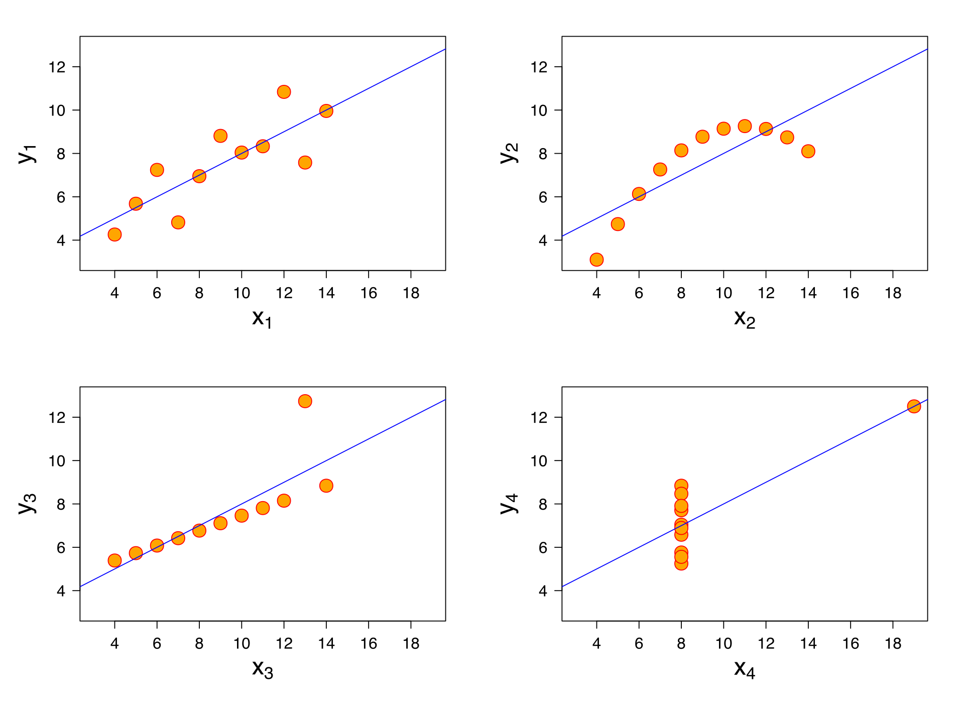
All of the relationships look completely different! This dataset is called Anscombe’s quartet, and you can read more (and see where I got this example from) on Wikipedia. Hopefully this should demonstrate to you why we can’t just make tables of summary statistics. Making visualizations is essential for good data science! If you don’t believe that after one example, take a look at the Datasaurus Dozen as well!
gt package.